Wednesday, June 3, 2015

Magazine Covers Through the Years

 This week I was intrigued mostly by the change that Graphic Design seemed to undergo once it reached America.  Now, I shouldn't be quoted on this, but I felt that a lot of magazine covers up until this point were mostly mashes of abstract designs and typefaces (though that could just be an impression drawn from images meant to specifically illustrate those points).  Those early magazines were about as far from the covers we see populating the check-out shelves at grocery stores as, well, computers to the original print machines.

 So I wanted to cover some of that change as I saw it.

 I chose Seventeen for two reasons:
     The first is that it was created by a woman for women, or young women.
     The second is Cipe Peneles and the simple fact that I really liked her cover and wanted to use it.

 Without further ado, let me tell you a little about Seventeen.

 The magazine was created in 1944 when Walter Annenberg, the publisher of magazine Stardom, approached Helen Valentine about how to sell his magazine to a younger audience.  Valentine took the opportunity and ran with it, creating the first magazine directed specifically at a teenaged audience.

1940s
  These covers were pretty simple.  Basic images of young women, the magazine name, the issue date and cost, and occasionally the title of that particular issue.
 

1950s
  We start seeing hints of what's in the magazine.  Those little teasers of what might make you want to buy it.  But the text and the photos still pretty much have their own space.  Some overlap is allowed, but clearly you're supposed to see the text, and the photo as separate entities as much as still part of the same whole.
 

1960s
 

1970s
  Please keep in mind that I'm working off a Google search, and not Seventeen archives, but I wanted to point out that the 70's was really the first time I started to see these really close up shots of the girl's faces.
 

1980s
  There were a lot more of these really close up face shots coming up in the 80's, which means that there's a lot more overlap between the photo and the text.
  Also, this is where I start recognizing the people on the covers.  Like, hey, Molly Ringwald.
 

1990s
  We seem to have gone back to the body-shot.  But now the text is on both sides of the cover.
 

2000s and Now
  This was definitely the hardest part: finding covers from the 2000s, and not from 2010 on.  In the end, I just gave up.
  A few things to note about these new covers is that the text is still mostly on one side of the page or the other, but it's no longer stuck in those neat little columns.  Now it's everywhere, seems rather fitting for today.


 Also, if anyone is interested, I did some background research on Seventeen and found this article particularly interesting.

Tuesday, May 12, 2015

Grafitti... Sort of?

I'm going to recommend watching the first 2:30 of this film.  You could watch all of it, it's pretty interesting, but it is an hour and a half long; so unless you have the time right now, you might want to come back later.


Watched those two minutes?

Good.

Here's the point: public opinion and quality.

These two things may or may not coincide, but they do have strong ties to each other.

A great part of the Art Nouveau movement came as a reaction to the materialism created by the Industrial Revolution, and the decline in the quality of work.

A large part of the Street Art movement comes from a reaction to materialism and government.

Again, these might not be the same thing, but they are very similar.

The movie focuses on a man named Thierry Guetta, a French immigrant, who managed to be almost at the very start of the Street Art movement.  And not only was he at the start of it, he caught a great deal of it on camera.  He followed many of the greats for years before delving into the world himself. And when he did that, he did it almost overnight.

Generally, the public views graffiti as graffiti, and street art as street art.  What's the difference?  I'm not sure I could tell you.  Mostly, it seems to be just how much a particular piece or line or shape appeals to an individual person.  But to law enforcement, it's all graffiti, and it's all illegal.

Funny thing is, you can get paid for doing it.

Street Art has become such a widely known phenomenon that well works by well known artists sell by the thousands at exorbitant prices.  And they sell to everyone.

Here's where the quality part comes in: one of the most prolific and well paid street artists?  Thierry Guetta.

Now, this might not make a lot of sense unless you've actually seen all the movie, but the quality of the man's work is... shall we say, unimpressive.

Which is how public opinion and quality tie together.  It would seem that, to the general public, quality is not quite as necessary as the name placed on an object.  If someone offered you a Banksy sketch, something utterly ridiculous, maybe a few lines on a piece of paper, a smiley-face somewhere, which would matter more?  The lines, or the person who drew them?

This is, essentially where Art Nouveau came in.  When the Industrial Revolution allowed for more and more people to have works of art, the public was happy.  The artists were not.

Street Art isn't necessarily the next big thing in the Graphic Design world.  Maybe it is.  I'm not sure if it's gone on long enough yet for it to be considered the next big movement.  But it seems to me to have shades of a movement long past, shades of a struggle that hasn't quite been able to work itself out even hundreds of years later.

Wednesday, April 29, 2015

Publishing Mark

What I found most interesting about the earlier workers and printers was the way that they showed ownership over their work.

These days, each person has a signature.  We are made unique by our last names and the way in which we sign our names.  There is never two who are exactly alike.  Personally, I find this a very efficient use of the alphabet that we have worked so long to develop.

In the origins of writing, however, there was often no such thing as a way to write ones name, especially as many people were illiterate.  As such, the early peoples of Mesopotamia developed what was called "personal seals."

These seal were careful, and unique carvings around a cylinder that, when pressed into wet clay, would leave a mark at the bottom of pages, or the base of products.  These cylinder seals continued to be popular throughout Greek and Roman times, until the rise of the more modern empires made their use all but unnecessary.

With the rising of more modern Europe, came the new, and much simpler alphabet.  Which made it easier for many people to read, and as such, made more people want books.  As the demand grew, printing presses developed.

As the printing press developed, people again sought ways to claim their work.  This developed publishing marks.

Originally these marks were very simple, very personal marks.  Many often had religious, or local connotation.

These days, publishing logos are from big companies, their original creations mired in years and stories.  We now recognize companies, rather than an individual when we see their logos.

http://www.theguardian.com/books/2011/nov/16/penguin-self-publishing

Watson_Guptill_logo.png


Wednesday, April 22, 2015

Concerning Literacy

I think what struck me most about the development of language was how many people originally were literate.  These days, particularly in the United States, there is a school right around the corner, and everyone is required to attend, at least for a time.  There isn't, or shouldn't be quite as much illiteracy as there is in the States.

According to do something.org, "1 in 4 children in America grow up without learning how to read."

In a country with schools everywhere, this is an unbelievable number.  And we don't really have an excuse as to why things are this way.

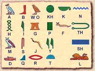
In earlier times, I can understand why you would have only a small group of people that could read or write.  After all, these are images of essentially the same thing, and yet, their direction is different, the detail changes, and apparently there can be more or less in terms of letters depending on where you get your information from.


But today, our alphabet consists of only twenty-six letters.  That isn't very many.  In fact, it's harder to remember the Declaration of Independence than it is to remember the alphabet, and typically in America we learn those things at the same time.

So why are there so many people that can't read?

The unfortunate thing is that we really don't have an answer.  Some people just fall through the cracks: even though they've been going to school somehow they manage to scrape by without actually being literate, not ever getting help to improve that skill.  Some people don't have the means to get the additional help that they need and so they never put the effort into reading and writing.  And, difficult as it may be to believe, especially in California, some people just aren't going to school.

There isn't one clear answer as to why people can't read or write.  But statistically, those who can't read have a higher rate of being jailed than those who can.  Which, for me, is where I come back to the ancient times and the fact that so few people could read.  Obviously we, humans, managed to get through centuries with only selective literacy.  And while these older societies weren't perfect, the inability to read and write didn't correlate quite so strongly with the chance that a person was going to commit a crime. 

Which brings me to the one question that I cannot answer:

       What changed?

Tuesday, April 14, 2015

Module 1. Preface and Every Picture in the Book

My immediate thought after finishing this reading assignment was about the abundance of text.

I've never considered myself to be especially knowledgeable in the area of graphic design, actually, it frequently seems that for every thing I think I know there are ten other things for me to learn. Originally, I'd believed that Graphic Design had to do solely with graphics. At some point I realized just how naive that was. What is a graphic, but art?

The introduction of Megg's book really did clear up a few things for me, however. Learning that the term "Graphic Design" is so new really helped to explain to me exactly what things were going to be coming from. I realize now that graphic design involves so much more than just the colors and structures on the page.